The #arttoart question this week is one I've pondered for a long time: How do I make my illustrations look retro? I love the style but have never really been able to confidently say I know what characteristics make something look "retro". And by "retro", I mean roughly 1940ish - 1960ish. Some may argue that I should call it Midcentury but I'm not going to open that can of worms. Let's just simplify and call it retro. If you have any comments or questions to go along with this, please share! I'll report my findings on Sunday night! xoxo :)
art-to-art
KelseyAnneArt introduces "art-to-art." A place where we can have heart-to-hearts about art. <3 (Really proud of how many times I got the word "art" in that sentence). As long as I've been an artist, I've found myself frustrated about art rules that you're taught and then a few years later, you're taught about all the great artists that broke those rules and why it was mind-blowingly awesome. I never knew (and still don't) when it was ok to break the rules and when I looked like an idiot for breaking said rules. I thrive on boundaries, on black and white, on definitive guidelines. Blame my Libra-ness.
On top of that, the art world can be a scary place. You put your heart and soul into a piece, it's your baby, you name it, you nurture it and then you reveal it to the world and the response is... less than desirable. Maybe this is just me coming from a graphic design background, but we artists can be snobs. Hear me out: we're very critical, i.e. blasting people for using Comic Sans or God forbid PAPYRUS. I know full well that they're fonts that are never used for the right purposes BUT a lot of people don't, and what are their resources for knowing WHHYYY? So whatever level you're at as an artist (or plumber or accountant or CEO), we can all probably agree that we're emotional, sensitive, squishy creatures that don't want our artwork babies to be judged harshly by fellow, critical peers.
So how is anyone supposed to get better?? I realize that I might be out in left field here but I've always felt like there's a lack of safe havens for me to ask a question about art and get a direct answer—whether it be about hand-lettering, illustration, art supplies, etc. You're probably thinking, "Just Google it." But it's not that simple. How do I ask Google a question that sounds like this: "What's that ornament in the middle of letters that look like little pointy things that some hand-letterers use?" (This is a legitimate question that I have and still haven't been able to find the answer. I've been hand-lettering for 6 years. NBD).
If I haven't made it clear already, I am FAR from being an authority on anything even though I've dedicated nearly my entire life to art. So my mission with "art-to-art" is to pose questions that either I have or that you have! And dedicate a week to trying to find the answers through the Internet, through speaking with other artists, through comments from readers, etc.! I will present the question every Monday and report back every Sunday night. This is meant to be a collaborative effort where no one feels like a schmuck, everyone has a voice and we just learn together! So leave a comment with any questions about art that you may have and we'll start a running list of topics to go over. Let's do this!
#arttoart
Santa's Grocery List
Download a FREE Christmas illustration here!
Read moreDaily Halloween Drop Caps — #halphaween
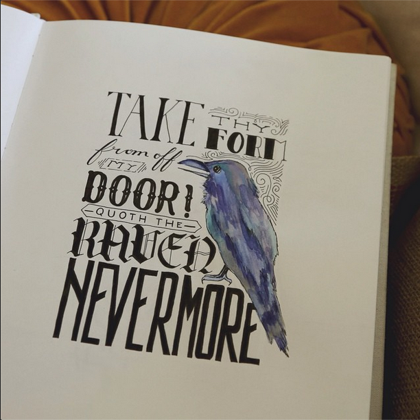
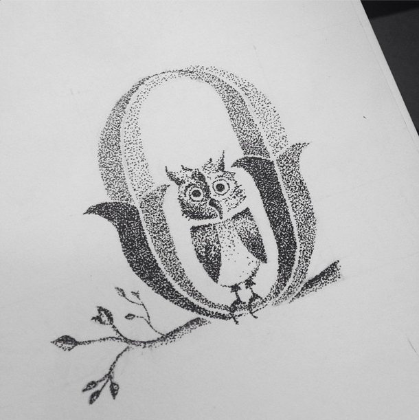
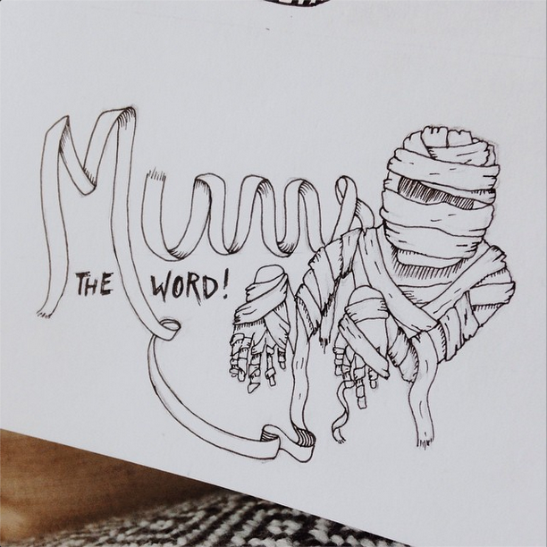
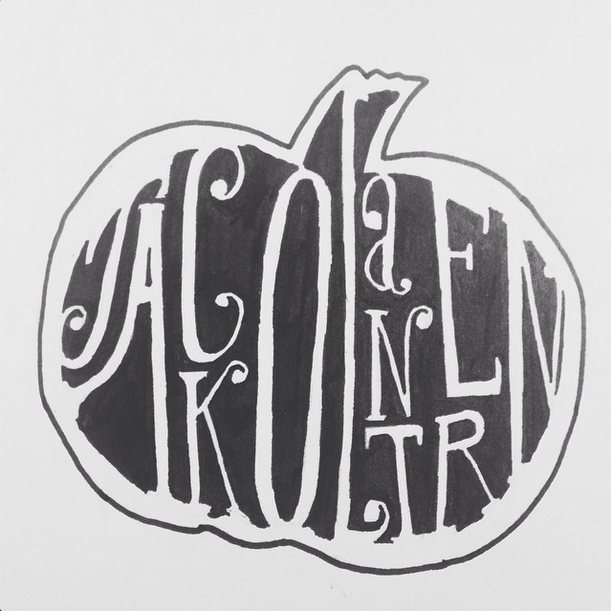
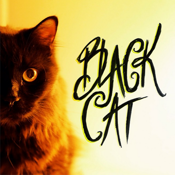
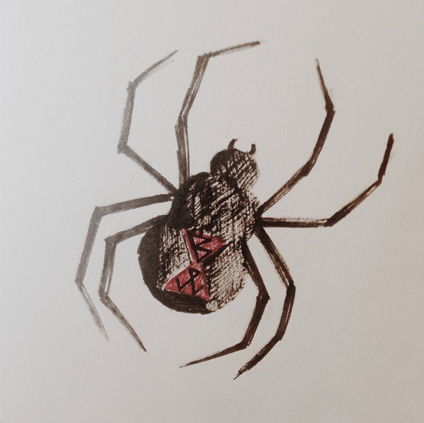
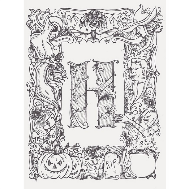
Nothing like a Throwback Thursday! As a few of you know, I love Halloween a lot... maybe too much. And to celebrate that glorious holiday and make the feeling last as long as possible, I create a Halloween inspired doodle every day for the month of October. I've been doing that for 3 years now! I gotta say that this year's theme was my favorite. My personality was really jam-packed into everyone of these illustrations and I just had a blast making these. The theme this year was a daily drop cap with vintage inspired illustrations to go along with them—I called it Halphaween. It was so fun to see which ones were people's favorites. It definitely surprised me. The top favorite was the letter M for Mummy! Second place went to N for Nightmare and third place went to R for Raven. The least favorite was C for Cat. (And I thought the internet was made for cats, shrug!).
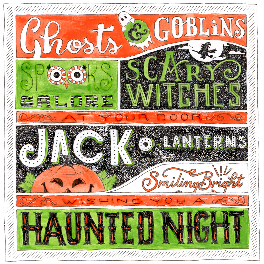
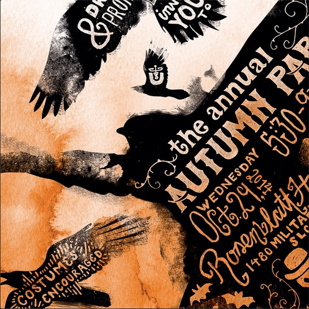
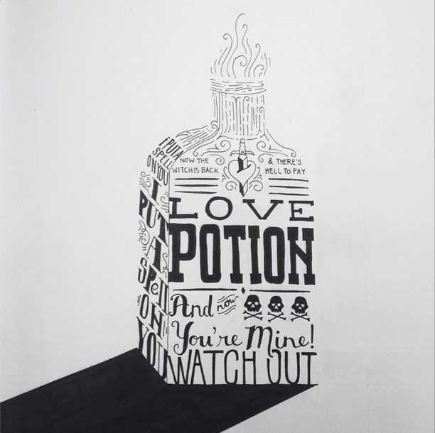
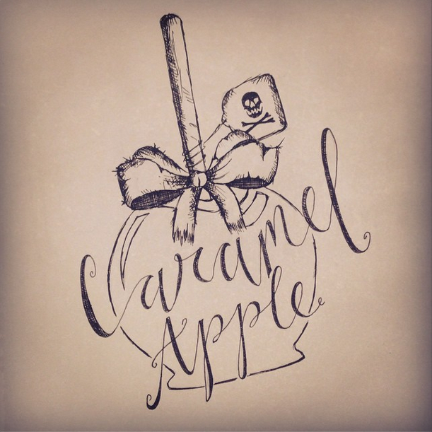
On Sundays, I took a break from the drop caps and created signs that I liked to imagine you would see back when things were simpler and you had to walk for miles around your neighborhood to get the right amount of candy! None of this trunk or treat mumbo jumbo. These took a lot more time and I wanted to pack them full of detail which also made laying everything out a fun challenge.
Thanks again to everyone that left feedback and stuck with it for the entire 31 days! You guys make it all worth it! xoxo
Style? FOUND.
Three years ago (what, that's so long ago, I'm so old) I wrote about "Finding Your Style as a Designer." While I don't think I'll ever be 100% committed to one style, I have found one that speaks to me, one that I'm naturally drawn to and one that makes me proud to look at once the piece is all done. This alone is a landmark for me. It has been like living with writer's block since high school art class. But not anymore!
The style consists of loose, thin, black inked outlines, free and haphazard brush strokes and a subtle dry brush texture to bring out the shadows. If this style were to have a message it would be, "Hey, forget about staying in the lines so much."
This style of painting paired with my love of typography and hand-lettering is producing some great results. I'm just over the moon about this recent success! If any of you are like me and have struggled for years trying to find your individual artistic voice, I hope you find some comfort in the fact that I get you. I soooooo get you. All I can suggest is to keep sketching daily. And keep looking at other artists and deciding what speaks to you from their styles and why.
Meet Me in the Woods
I really WANT to love the woods. I yearn to love hiking and sleeping under the stars and all the romance and great photography opps that come along with it. But once I'm in said woods, all I can focus on is bugs, mosquitos, swat them!, kill them all!, cold, so cold, sleep on rocky frozen ground, hunger, peckish, birds in the morning that are just ungodly loud, etc. Sure, call me high-maintenance. (But in the moment I'll be super defensive and in that same moment my head will be telling me "Yes, you straight up ARE high-maintenance. Accept your identity." It's a constant battle. Cherish your sanity.)
I do love nature from affair and in small bits though - taking drives through the canyon, picnics, looking at nice nature pictures.. you know. And my goal is to really learn to look past the bugs and the damn birds and the cold and be able to have a fun adventurous time. I'm working up to that.
This is a long introduction to my most recent hand-lettered piece. There's this song by my most favorite band in the world and it makes me feel alive and woodsy. It's called "Meet Me in the Woods" by Lord Huron. I decided I just needed to doodle out the feels that song creates in my bod and came up with this. It's a FREE downloadable desktop background! (And you're welcome). It's 1024x768 for standard computer screens. If you have screens that are 1920x1080, here you go. And if you have a huge 2560x1440 screen, here ya go! If you have another size not included here, no worries! I'll make it for ya! Chalk it up to my charitable spirit. Just email me at kelseyanneart@gmail.com with the size you want and I'll email it to you. And thank you for following Kelsey Anne Art.
#31daysofhalloween
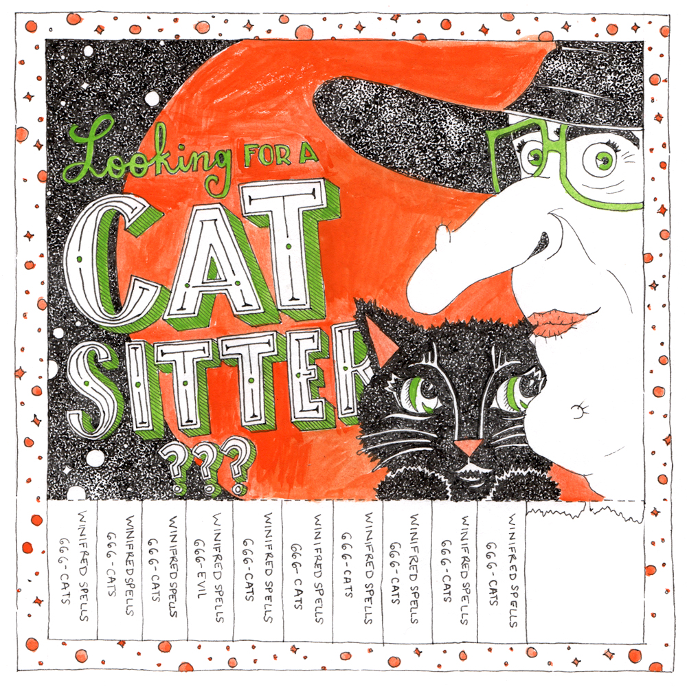
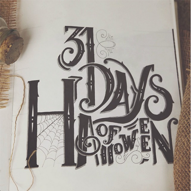
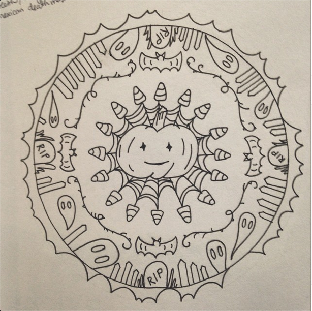
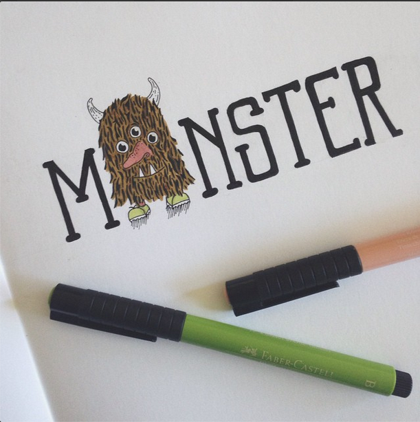
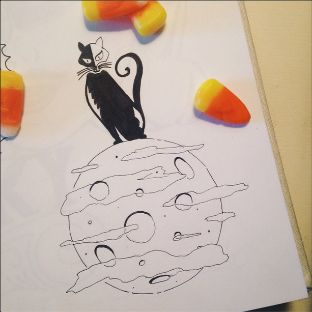
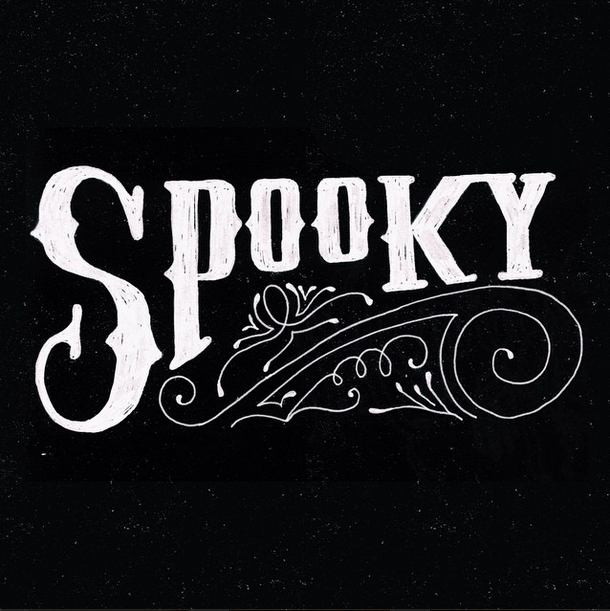
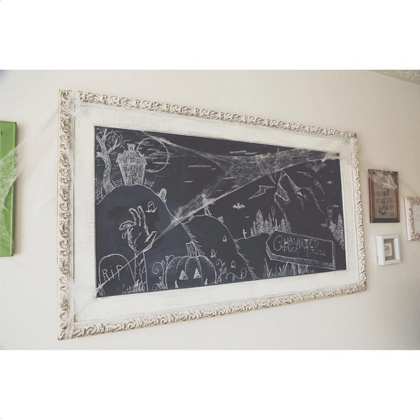
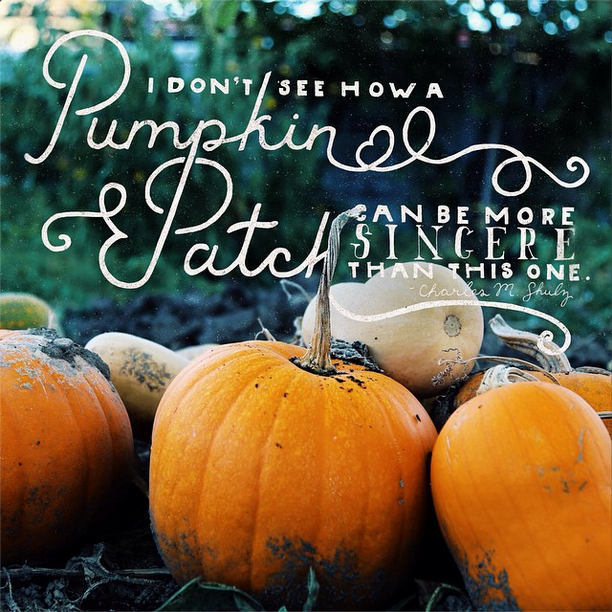
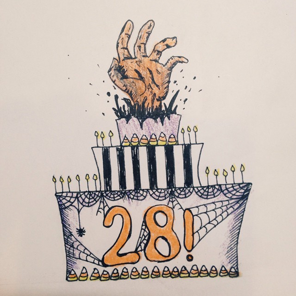
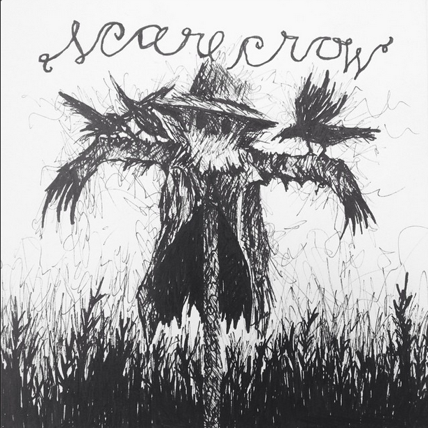
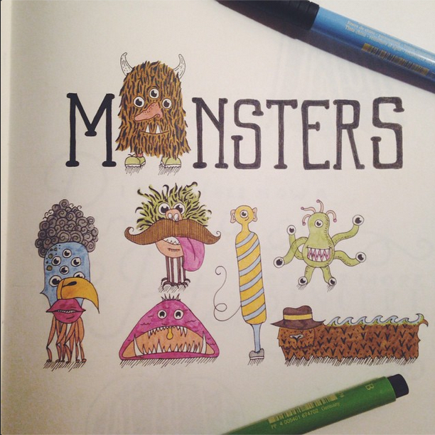
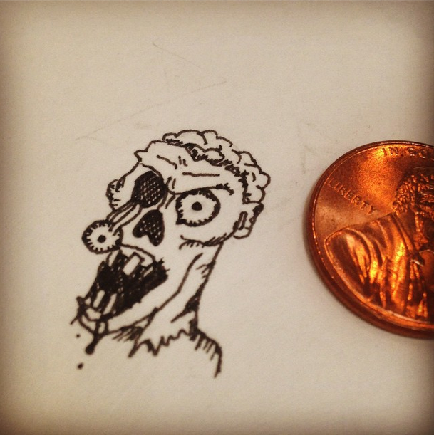
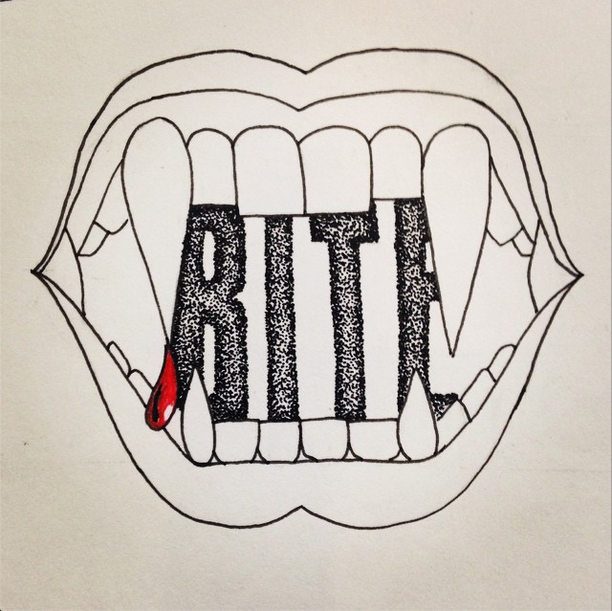
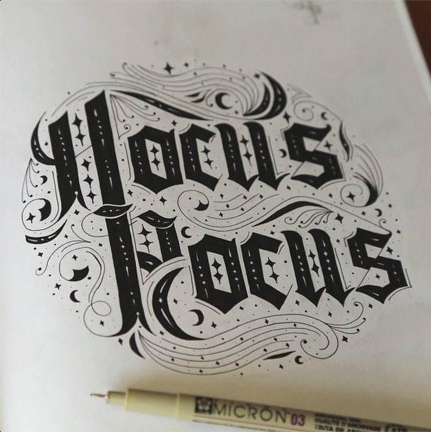
Halloween is one of my top holidays. I love the colors, the creatures, the stories, the CANDY, the pranks, the chili cook-offs, the memories, I could go on and on. To help spread the Halloween spirit, I decided to create a Halloween doodle every day and post it on Instagram, Twitter, and Facebook. It was a happy coincidence that #inktober was going on at the same time. I got really great positive feedback and it was just so fun to do this, I hope you enjoy!
Lovin' Me Some Layers
We're in the midst of autumn, ladies and gents and with that I've been pondering a lot on layers. Yes, I know that was quite possibly the lamest thing you've ever heard me say, but hear me out. Layers are a staple of fall fashion—a plaid collared shirt under a chunky sweater, so just the collar and parts of the sleeves are poking out all under an amazing leather jacket. Or maybe awesome lace looking tights under thick boot socks which are under some awesome boots! LAYERZZZ!! Ok, I digress, but see how important layers are for fashion? They're just as important for graphic design—and not just the Photoshop kind of layers (that's the type of joke my dad would make.... what have I become).
So what exactly do I mean by layers? Obviously you can't just sandwich a bunch of elements together and call it good. There has to be a happy medium. You can't have too many layers because then it becomes chaos and unpleasing to the eye. Especially if your layers are textured. So keep that in mind. When I say "layers", I mean, different shapes, flourishes, a small amount of textures, etc. all intermingling together, with some well placed overlapping. This is why retro logos are so successful: because they're fun to look at! (See the "Go Retro with your Logo" blog article I wrote ). We as human beings like to be rewarded for looking at something. I believe layers do that. Layers entertain the eyes. Layers are also what set apart the good scrapbookers from the bad ones. Little details that add dimension and charm to a scrapbooking piece or graphic design piece or fashion piece! That is where the reward is for 'dem ol' eyeballs.
If you're ever faced with a new graphic design project, consider what icons, shapes, curly Q's, and whatever else you can work into it during the brainstorming stages to make it a success.
Here is a logo I've been working on for a local fraternity. They wanted a lot of information packed into one logo so what did I do? I layered. :) With the ribbon across the front for the fraternity's name with a second, smaller ribbon on top of that for "Kappa Psi" , all resting on top of the badge shape. It's fun to work in shadows into the logo too, which I did here. I didn't just pick "Drop Shadow" in Illustrator, I made it have a line texture which looks more legit (in my humble opinion). Using that solution also was a great way to mimic the line texture I used in the mountains to keep the whole logo cohesive. An example of little extras/details I slipped in there was the herb/plant element in the bottom—it also serves as a sort of foundation to ground all the elements. The grinding bowl was a small but powerful way to show (instead of just tell) that this fraternity was a pharmaceutical fraternity. The frat loved it and my next step is adding some color to it! Look for it on my "logos" page in the next week! It's all in the details peeps!
That's all for now! Thanks for reading!
Finding Your Style as a Designer
Along with figuring out who I was (if I had a sense of humor, if I was a girl the popular boys were going to pay attention to, if I was the straight A student or the rebellious kid, if I was going to live my life as a white, pasty girl or fake bake, etc.) in seventh grade, I was also figuring out what my handwriting style was going to be. Correct me if I’m wrong, but I don’t think most seventh-graders worry about making their handwriting memorable and cute and feminine and serious and responsible—all at the same time whilst timing how long that hot boy looked at them to see if it was a romantic lingering look or just a casual glance. So yes, I’m quite quirky.
I played with the descenders on my Y’s. Should I have it curl? Or have it become sort of the underline, going straight under the word? I toyed with making the dots of my I’s and J’s hollow, and that just looked childish. I couldn’t possibly have that as a young adult. Perish the thought. After seeing how a girl wrote her 8’s in choir class, I decided that no longer would I write them out like a vertical infinity sign, no. Instead, I would stack two perfect circles on top of each other to form my 8.
Just like my middle school exploration into finding my trademark handwriting, we as graphic designers are always searching for our unique style. But is that what we should be looking for? The argument is on going.
Many famous and talented graphic designers say that having your own uniqueness is very important because you need it as a way to stand out. Brazilian designer, Guilherme Marconi, elaborates, “That’s why clients, agencies and the people that buy art always choose you. You have created a style that they want for their next ad, or on their walls at home.”
On the other end of the spectrum, other graphic designers that are just as famous and talented say that trying to establish your own look is not important at all. Brian Smith concludes, “A designer’s style being important is totally irrelevant. The importance of the designer to express his or her self supersedes any particular style he/she chooses to adopt.”
A lot of other graphic designers say both are vital; being unique, but also being versatile enough to know what a specific brand needs or to embrace current design trends. Also, once you have found your niche, it might be easy to just relax in comfort, but we mustn’t do that! We should always be challenging and stretching ourselves to create new designs and new uniqueness.
For me personally, I am going to continue trying to polish my own style when it comes to personal work. The idea of someone being able to look at one of my pieces and say, “Hey! That’s a Kelsey!” just makes my little heart do flip flops. Granted, I may have to change my name to something a lot more hip if I want that to happen. And when it comes to client work, I will strive to deliver the look that I feel the specific brand or client needs to be successful.
To figure out your style, I suggest the following:
- Study art history, from prehistoric cave drawings to today’s trends. See what you gravitate to and then imitate the images you saw.
- Get away from the computer and put a paintbrush, or heck, even a crayon in your hand. Sketch something and make it look as close to real life as possible. Then from there, simplify. And from there simplify more. See what you come up with.
- Experiment! Experiment with different textures, colors, shades of colors, perspectives, materials, etc.
- You’ll be naturally drawn to certain styles, so figure out what those are and then make them yours by adding your own personal touch – whatever that may be. For me personally, I wish I could’ve lived in the 50s. I just love everything about that time. Along with that, I love retro graphics, so that’s what I’ve been trying to get better at.
What do you think the key to being a sought after graphic designer is?
And more importantly, what should my new, hip name be?
Go Retro with your Logo
Businesses and organizations often opt to throw it back and create retro-inspired designs. This takes many consumers back to the good ol’ days as retro designs fill them with nostalgic fondness. Retro logos are no different as they appear dependable, long lasting, classy, and friendly all at the same time. So how do you create a retro logo? Well, to answer that question, it helps if you understand a couple things.
Read moreMacro-Managing
There aren't a lot of things that drive me more insane than being micro-managed. Not only does it prove that my employer doesn't trust me but it also proves that they don't trust themselves. They don't trust themselves to hire trustworthy people. (Do you feel like we just entered Inception too?) A while ago I was working for a company where the higher-ups didn't trust anybody that was below them on the corporate ladder. The first few months I worked there I noticed that my cube neighbor would spy on me. And once a day she'd ask what I was doing. Was she my boss? Not even close. Was she actually below me in the corporate ladder? Why yes indeed. But after a few months, she and I became friends and she confessed to the fact that my boss asked her to spy on me. (WHA???) I had done nothing to deserve so much mistrust - it was just the atmosphere of the whole place. Bless its heart.
I'm currently working for a company that I totally adore. Everyone just does their job and if they decide to get on Facebook or Youtube for a second, no body gets in trouble or is judged. You know why? Because we get our work done. Period. And as much as some employers like to deny it, there are down times. Whoever decided that every job in the U.S. could fill up 40 hours a week was on something. Sometimes you need to take a 3-5 min. break for your mental health and there shouldn't be anything wrong with it if you get your work done!
Because my bosses trust me, I trust them. I haven't been at this job for very long and I know I've already improved not only in graphic design but in illustrations and photography and art in general. The dialogue is positive, encouraging, and we talk like we're equals. There are some days that I don't even talk to my boss and guess what, I still meet my deadlines. At the workplace I mentioned before, I had to instant message my boss to let them know I was leaving my prison, err, I mean cubicle if it was going to be longer than 5 minutes.
So employers: don't micro-manage. Trust your employees. Give them the benefit of the doubt. If they give you a valid reason that they shouldn't be trusted, then go from there. But I can guarantee that if you assume the best of them from the get-go, there's a much higher chance that you'll get the best work and morale out of them.
