Guys. Holy cannoli, this week's question was really hard to answer. I found myself in the depths of font research from 1850 and so desperate for answers that I somehow found the courage to send DMs to a couple of major typography Gods just hoping that they'd answer and to my surprise and huge appreciation, they responded! So let's dive in.
We'll start with the description of script: "Script typefaces are based on the forms made with a flexible brush or pen and often have varied strokes reminiscent of handwriting. There are many different classifications including Brush Script, English Roundhand and Rationalized Script. However, the broadest forms of classification are Formal Script and Casual Script. Formal Scripts are based on the developments and writings of 17th and 18th century handwriting masters such as George Bickham, George Shelley and George Snell. Casual scripts developed in the 20th century as a result of photo-typesetting and are more varied and the inconsistencies appear to have been a result of using a wet pen rather than a pen nib.” (Source: http://www.designishistory.com/1450/type-classification/) Since we're not using a wet pen OR a pen nib, this might not be helpful to us. But Scott Biersack (@youbringfire) said: "Script essentially refers to letterforms that are joined together by a single movement of the hand. But, in this case, since we're drawing, it will be the buildup of pencil strokes. It will consist of many, many strokes that will be made to develop and refine the letterforms... rather than completing the letterforms in one movement as you would with calligraphy.” (Source: https://design.tutsplus.com/tutorials/hand-lettering-scripts-swirls-flourishes--cms-22560)
The Formal Scripts (just FYI) include the following:
- Roundhand
- Spencerian
- Copperplate (term applied to the English roundhand script)
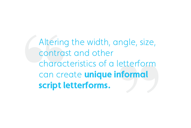
The type of script we're concerned about right now falls under the Informal Script category. [Informal script]..."is much more flexible. It has some roots within formal script, such as letterform construction, but it has the ability to be completely unique from its origin.The overall speed, composition, color, size, and other factors vary with informal script. Altering the width, angle, size, contrast and other characteristics of a letterform can create unique informal script letterforms.” (Source: https://design.tutsplus.com/tutorials/hand-lettering-scripts-swirls-flourishes--cms-22560)

By Ken Barber
So now that we understand what exactly the definition of "script" is, how does this help us understand how to recreate the chunky, retro style script? Well, to answer that, I had to find the origin of it which was near to impossible. So this is the point where I got desperate and just straight up DM'd Scott Biersack and he was so gracious and responded so promptly! He said, "To answer your question, I personally don't know the exact origin of that style but I'd say it possibly could have been Italian Spencerian script..." So on to researching Spencerian script I went!

By Ken Barber
Let me give you a snippet of what I found in the book "Spencerian Key to Practical Penmanship" by H.C. Spencer, Pratt R. Spencer. "The shade upon t and d is heaviest at top, tapering gradually to the lower turn. The shade of the small letter p is the reverse of t, commencing on the ruled line, and continuing to the base of the letter. When two p's’, d’s’, or t’s’, come together, the first is shaded while the second receives a half shade only. These letters have the preference in shading, hence, small loop letters, immediately connected with them, are not shaded; for example: th, dl.” DID YOUR BRAIN BREAK BC MINE DID. What I translate that into is "memorize how each letter should look because each one will be different and then those rules will change depending on what comes after it so GOOD LUCK WITH THAT." I know there might be typographers reading this thinking "yah, that's typography for ya." Which yes, it is. You have to be aware of different factors like that when creating a font but dude, I just want to know why it's ok to put the thickest part of the letter at the bottom sometimes.
Fortunately, Biersack recommended I read this interview with Ken Barber (@typelettering) where he discusses learning from the past to do better now. (If you want to read the interview, here's the link: https://medium.com/type-thursday/learn-from-the-past-to-do-better-now-c94dfcffde2a). It didn't quite answer my questions so I went directly to the source. Barber was amazingly gracious with his responses. He said, "As far as I can tell, this style stems from a drawn version of exaggerated American handwriting developed for advertising during the late 19th century. The original Coca-Cola logo from the 1880s is a prime example... if you want to get SUPER technical: it's a stylized version of Spencerian display lettering." So I was wrong when I called it a brush script—definitely not that!
Now, if you look at formal Spencerian script and the retro script we're discussing, there's very few similarities between them. This really frustrated me at first. But then I realized that if I learned anything from reading that mind-numbing Spencerian book, it's that you're allowed to push the limits of typography. You're allowed to fiddle with letters. That's both the beauty and the irritation of hand-lettering when you're trying to learn!
Ken Barber said it well in his Medium.com interview: “Considering that the letters’ forms have long been established, it makes sense to examine traditional models. However, that doesn’t mean there isn’t room for interpretation. Spencerian lettering from the 20th century is a good example of the evolution of lettering: the style is based on classic English roundhand, but its incarnation during the late 1960s and early 70s bears little more than a slight resemblance to its origins. When you consider the history of letterforms, how one idea is built on another, it’s only natural to look back in order to move forward." (Source: https://medium.com/type-thursday/learn-from-the-past-to-do-better-now-c94dfcffde2a)
To move forward and progress with your own hand-lettering in this particular retro script style, below are some tips from one of the masters, Ken Barber.
- Crank up the weight
- Lower the contrast
- Soften the terminals (If you're wondering what a terminal is, check this out: https://typedecon.com/blogs/type-glossary/ball-terminal)

By Scott Biersack
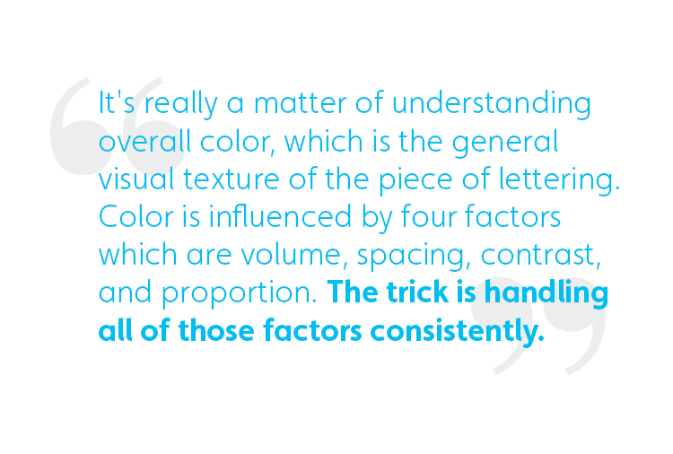
And lastly, this solid gold nugget of wisdom on how to master this style and hand-lettering in general, "It's really a matter of understanding overall color, which is the general visual texture of the piece of lettering. Color is influenced by four factors which are volume, spacing, contrast, and proportion. The trick is handling all of those factors consistently. Which means the volume or the fullness of the strokes is consistent, the spaces inside and between the letters are consistent, the contrast or variation in stroke thickness is consistent, and the relative sizes of the letters are consistent. If you apply those metrics to the lettering in question, we should see that for the most part they are handled uniformly to create overall cohesiveness in the lettering. That's the best guide for lettering like this that is a little off the beaten path." - Ken Barber.
xoxo
-Kelsey