"Everything old is new again." For the past few years, retro styled illustrations (and furniture and typography and clothing and and and...) have been trendy, making that adage spot on. But what makes an illustration look retro?? Is it the simplicity? Well, not exactly, because there are plenty of simple line illustrations out there that don't have that sentimental feel. This sentimental feeling I'm talking about had puzzled me for awhile because I couldn't put into words how to recreate that emotion—until now! I spent the past week researching illustrators that have perfected this style and reading articles about the limitations these illustrators had and how they brilliantly worked within them. So let's dive in to some simple bullet points that make retro-inspired art easier to put your finger on!
- According to www.productivedreams.com: "Limited use of colors is the prominent trait of retro designs. Full color printing was very expensive in the past. This prompted many designers to limit the use of colors in their designs. Two toned coloring was predominantly used by retro designers. Sometimes designers selected a focal color and blended it with few selected colors to create a unique theme.

By Aurelius Battaglia

By Cliff Roberts

By Bernice Myers
- Subtle use of textures and noise in the background and certain individual elements in the illustration helps in creating a visually appealing retro design.
- Distressed textures
- Halftone textures
- Dry brush textures

By Greg Paprocki

By Frans de Keuning
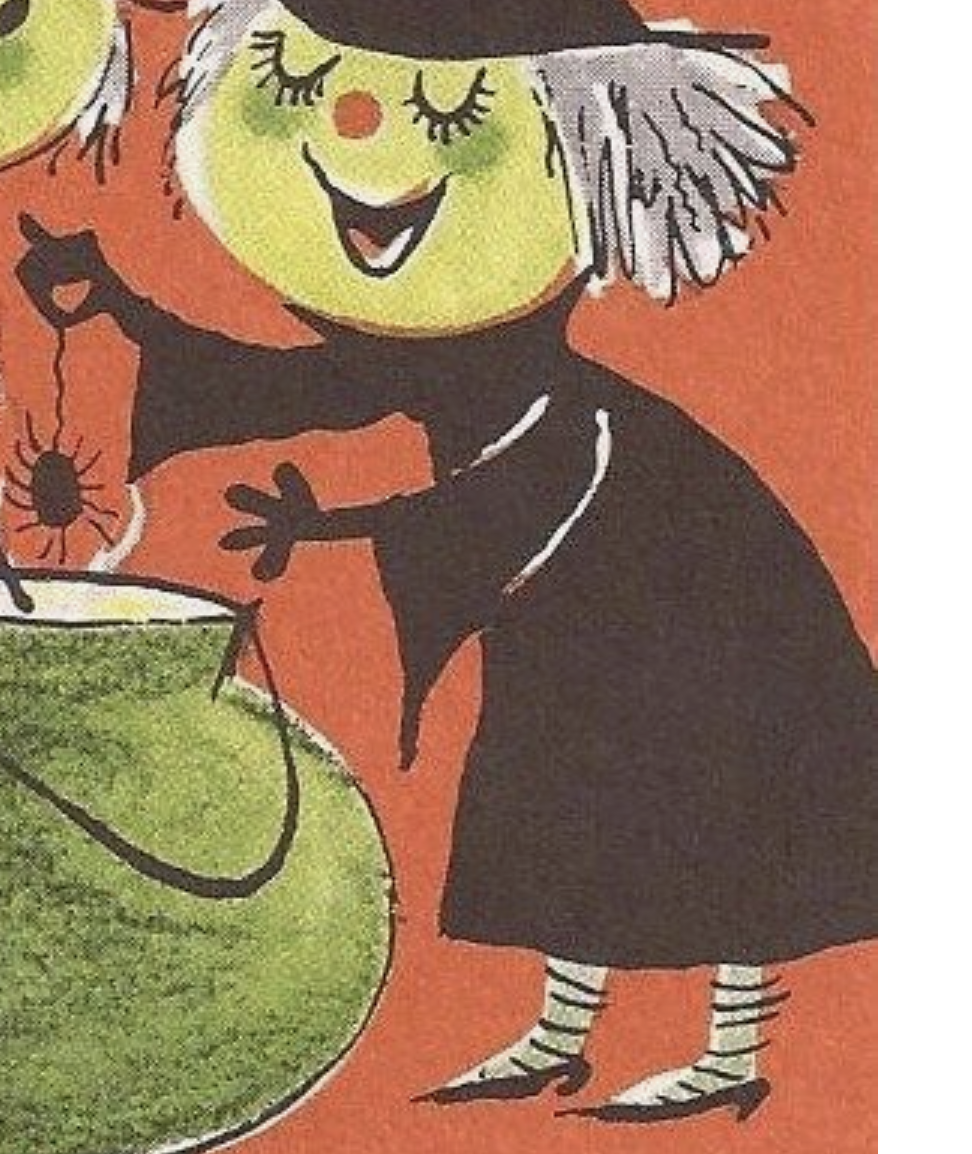
- Overprinting refers to the process of printing one color on top of another in reprographics. (Thank you Wikipedia). Have you ever noticed that the spots of color often don't line up with what they're supposed to? It's like the paper shifted during printing (which is I'm sure what happened). See the image below and really pay attention to the witch's hair, the green skin, and the socks! You can easily recreate this in your pieces just by being loose and carefree with your coloring!
Couldn't find who the illustrator was!
- Retro style illustrations are very simple. Eyes are usually very small: just filled in circles, open circles with filled in pupils or arches up or down to show happiness, snootiness or sleeping. Chins, mouths and noses are the facial aspects that are exaggerated.

By Cliff Roberts
By Fiep Westendorp
- Common elements that add playfulness to retro style illustrations are:
- Asterisk stars
- North star type stars
- Dots
- Hollow ovals
- Arrows
- What I like to call "Boomerang" shapes (See in Derek Yaniger's image)

By Derek Yaniger

By Cynthia Amrine

By Lalalimola
- Some things outlined loosely, some not outlined at all. (See that the petals in the flowers are not outlined at all while everything else is in a shaky, inconsistent line in the following image).
- Very flat, 2D

By Cliff Roberts
- Fingers that look like there are no bones in them.
- Hair is treated as a solid shape or showing every strand.

By Abner Graboff
- Limbs are exaggerated with pointy or very curved corners.

By Derek Yaniger

By Jan Balet
That about does it for tips I found to master the retro style of illustration! I hope that this was helpful and that it only makes your love and appreciation for all different styles of art grow!
xoxo
-Kelsey