Fortunately, this week's answer was easier to find than the previous week's! The answer to the question: How do I do retro lettering? Break lots of rules. :) Hahah much like the chunky retro script from last week, other fonts that are retro inspired breaks some rules. Here are some of them:

By Ken Barber
- Bouncy Baseline. 4 out of the 5 examples you'll see here have a bouncy baseline which means that none of the letters sit on the same line. (To find out more about baselines, click here). When you'er lettering yourself, don't go too crazy with the bounciness because we still need the word to be legible!

Couldn't find the illustrator!
- Inconsistent thick and thin strokes. This is a chance to have fun! You're not tied down to consistency here! But again, there is a balance that needs to be maintained! You want the letters to look like they belong to the same (albeit dysfunctional) family.

Couldn't find the illustrator!
- Pointy triangle serifs with little to no brackets. This probably is not the most technical of terms but it helps me get a visual in my head so I hope it works for you! If you're not sure what a bracket is, click here. And for a serif definition refresher, click here. I found these types of serifs all over the place while I was researching and let me tell ya: they're a hoot to draw!
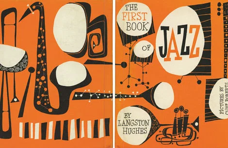
By Cliff Roberts
- Hairline serifs. I noticed in my research that most of the big headline text had the pointy triangle serifs while the subheads were in this hairline serif font. There's no bracket with these kinds of serifs which makes life a whole lot easier!

By Cynthia Amrine
- Simple, left-justified, Georgia-like font. And to throw everything off that we just learned, you can also go for the simple look that's reminiscent of primary school books like See Jane Run, etc. To get the characteristics down, just Google "Georgia font" and you'll see where the thick/thin strokes are, how the terminals are treated, strict baseline, etc. If you use this look in your lettering, it's always nice to pair it with a retro-styled illustration above and/or to the right of the text.
And that does it for this week! Please let me know if you have any questions you'd like me to research! And I hope these posts are helpful for y'all! I know they've helped me so far. :)
xoxo,
Kelsey